Task
Management,
by system. 🗂️
A clean and scalable task management interface designed with a component-based system — built to feel calm, fast, and intentional from the first interaction.
UI/UX DESIGN
2-3 WEEKS
COMPONENT SYSTEM
🌀PROJECT OVERVIEW
GOAL
Design a clear and intuitive task management experience supported by a reusable and scalable design system.
ROLE
UI/UX Designer
End-to-end
TIMELINE
2-3 Weeks
Solo project
TOOLS
Figma
Auto Layout, Variants, Components
🌀WHY THIS PROJECT
Move beyond static
screens — build a system.
I wanted to focus on building a system-driven product. Instead of designing isolated screens, I aimed to create a consistent and reusable structure that could scale across different states and interactions.
🌀EARLY EXPLORATION
From sketches to structure
Early wireframes were used to explore layout structure, hierarchy, and core interactions — before committing to any visual design.


01
Display & organization
Defining how tasks are displayed and
organized at a glance.
02
Selection & editing
Exploring selection and editing patterns for speed.
03
Flow before visuals
Structuring the overall flow before visual
design.
🌀FINAL EXPERIENCE
The product, end-to-end
Three core surfaces, each designed to keep the user in flow.

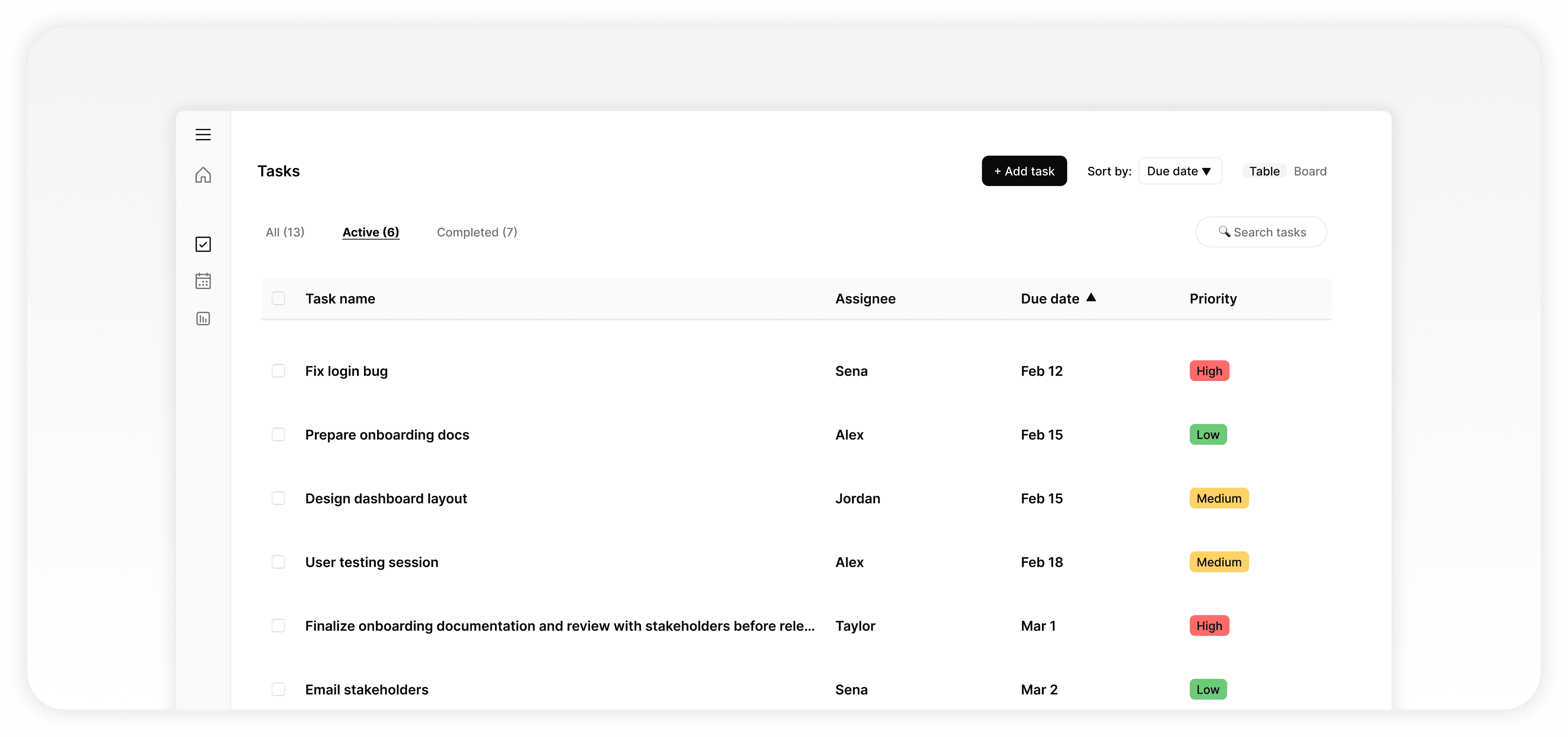
🌀TASK LIST
A structured overview, designed for scanning
The main screen provides a structured overview of tasks in a table format. It is designed for quick scanning, selection, and updates — minimizing friction in daily task management.
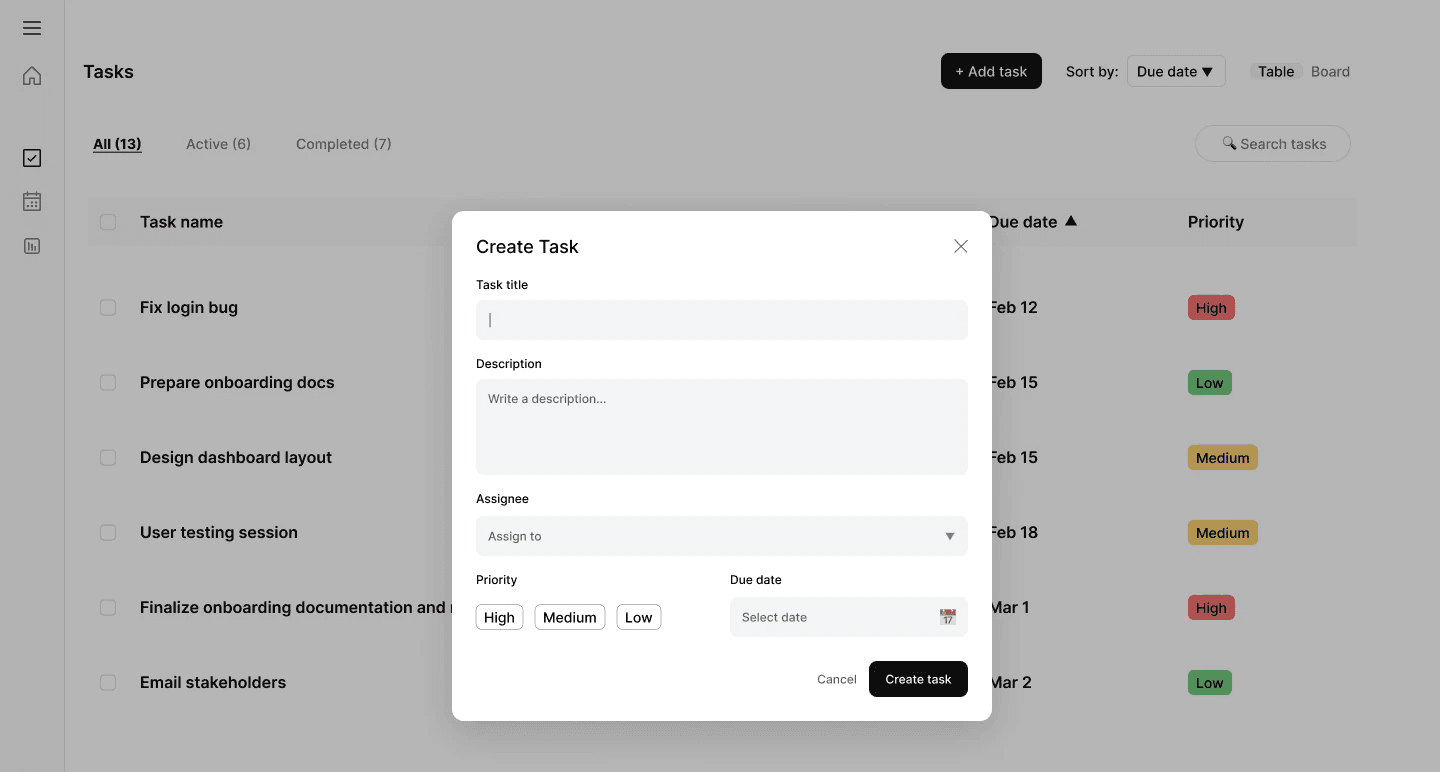
🌀CREATE TASK
Stay in context with a
focused modal
A modal allows users to create tasks without leaving the main context. The form is kept simple and focused, with clear inputs and validation.

🌀EDIT TASK
A side panel keeps the
list visible
Editing is handled through a side panel (drawer), allowing users to update tasks while keeping the main list visible — supporting a more seamless workflow.
🌀KEY FLOWS
Three patterns, repeated everywhere
FLOW / 01
Create Task
Users can quickly add a new task
through a focused modal experience.

FLOW / 02
Edit Task
Selecting a task opens a side panel for
inline editing.

FLOW / 03
Bulk Actions
Checkbox selection enables multi-select
actions such as updating or deleting
multiple tasks.

🌀SYSTEM STATES
Designed for every moment
Different system states were designed to ensure clarity and
feedback across scenarios — auto-cycling below, or click to inspect.

Empty State
Guides users to create their first task.
Loading State
Skeletons maintain visual continuity.
Filled State
The main task overview.
Error State
Clear feedback with a retry action.
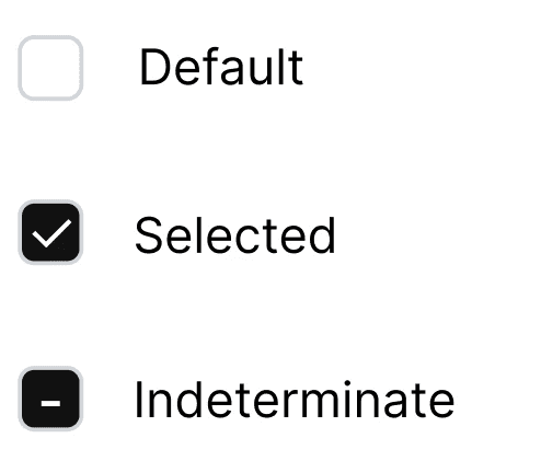
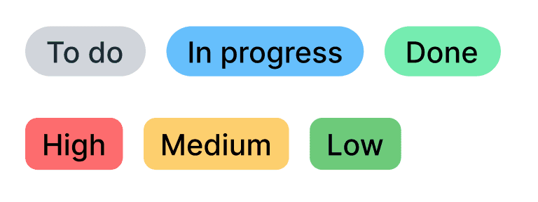
🌀COMPONENT SYSTEM
Modular by design
The interface is built using a modular component system — every primitive designed with reusable states for hover, focus, error, and disabled.
INPUTS
Text · Textarea · Assignee

SELECTION
Checkbox
BUTTONS
Primary · Secondary · Destructive

INDICATORS
Status · Priority
DATA
Task row · Table structure

🌀DESIGN SYSTEM FOUNDATIONS
A simple foundation, applied consistently

TYPOGRAPHY
Clear hierarchy for readability
SPACING
8pt grid
4px
8px
16px
24px
32px
48px
Primary
Actions and focus
COLOR
Minimal system, clear feedback
Neutral
Text and layout
Feedback
Success, warning, error
50
100
500
700
0
50
200
900
success
warning
error
info
VARIABLES (FIGMA)
Lightweight, scalable
Easier updates
Change once, propagate everywhere.
Consistent usage
One source of truth across the system.
Better scalability
Tokens grow with the product.
🌀OUTCOME
A clean, scalable interface — built to last.
By focusing on system thinking rather than isolated screens, the design ensures consistency, faster iteration, and improved usability.
Consistency
Across every screen, state, and interaction.
Scalability
Components and tokens designed to grow.
Usability
Less friction, more flow, every day.
🌀REFLECTION
From screens to systems
This project helped me shift from designing individual screens to building a system-driven product.
01 Creating reusable components
02 Designing for different states and interactions
03 Maintaining consistency across the entire experience
Other works
Built one thoughtful prompt at a time ✍️
Designed in Figma, made in Framer
2025