Vodafone Turkey,
Business. 💼
An end-to-end redesign of Vodafone Business's official website — rebuilding navigation, modernising the visual language, and lifting conversions across the board.
UI/UX DESIGN
APR — OCT 2022
WEB · RESPONSIVE
TEAM OF THREE
🌀PROJECT OVERVIEW
ROLE
UI/UX Designer
With two team members
OUTCOME
Official website redesign
Vodafone Turkey Business
TIMELINE
April – October 2022
TOOLS
Figma, Illustrator, Jira
Design system, hand-off
⚔️ CHALLENGE
A site that frustrated
users — and flatlined engagement.
The outdated website had poor navigation and lacked responsiveness, which frustrated users and led to low engagement. A redesign was necessary to enhance usability, accessibility, and drive conversions.
The redesigned Vodafone Business website has improved usability, making it easier for users to access solutions and support. With a cleaner design, faster loading times, and better mobile responsiveness, businesses can now connect with Vodafone's services more efficiently.
💡 RESULTS
A faster, clearer site — measurably better.
🌀BY THE NUMBERS
25%
Boost in lead generation across the business funnel.
28%
Increase in average time spent on
the website.
🌀PROCESS
Four phases, one shared playbook.
For the Sağlığım Cepte project, I wore a few hats — from design to development collaboration and client communication. It was mainly an app-based project, but we also worked on the website!
01
Research & Analysis 🕵🏼♂️
This phase was completed before I joined the team, focusing on identifying user pain points and gathering insights that informed the project's direction.
02
Information Architecture 📝
The structure and navigation were established before my involvement, providing a solid framework that guided my design contributions.
04
Visual Design & Style Guide 🖼️
Utilised Vodafone's design library and system to develop a cohesive visual language — colour, typography and iconography — ensuring consistency throughout the site.
03
Wireframing & Prototyping 📱
Designed low-fidelity wireframes to visualise the new layout and navigation. Developed a high-fidelity, interactive prototype to test the design.
💫 FEATURE / 01
A product page that
finally sells.
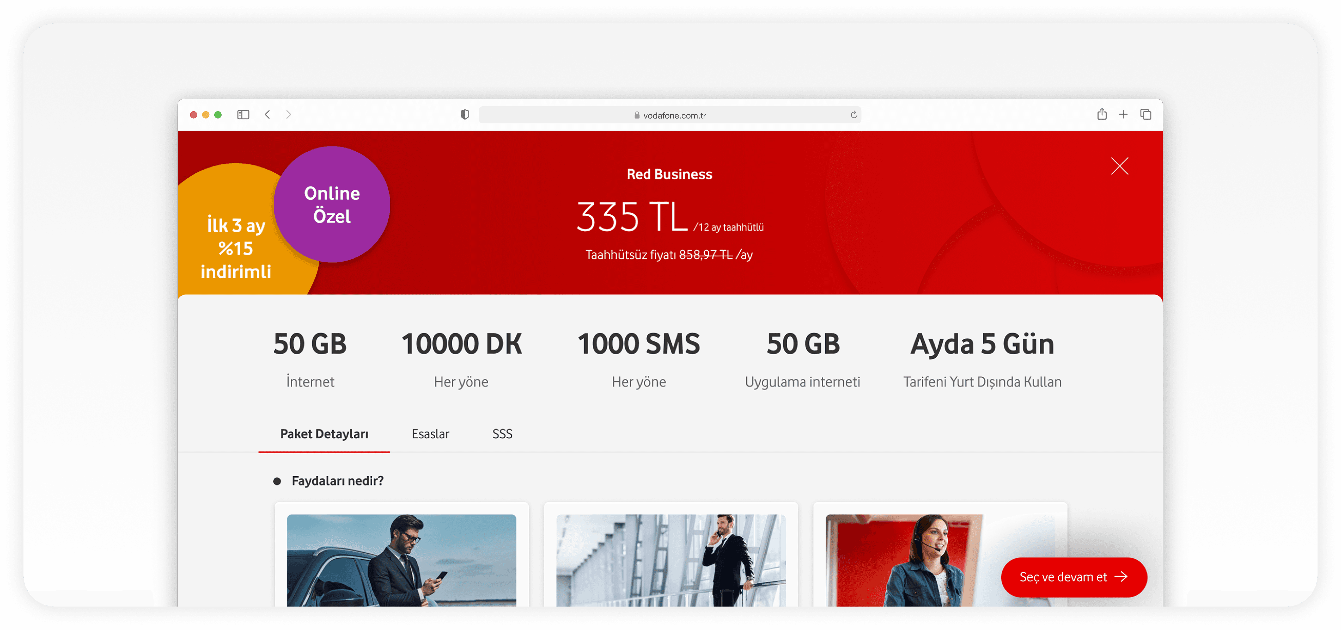
PRODUCT SALES PAGE
Reworked for engagement
The client highlighted that their product sales page lacked engagement, resulting in lower-than-expected sales. In response, we redesigned the product sales page to create a more compelling and user-friendly experience, optimising both desktop and responsive versions.
DESKTOP
RESPONSIVE
CONVERSION
💫 FEATURE / 02
Navigation, streamlined.
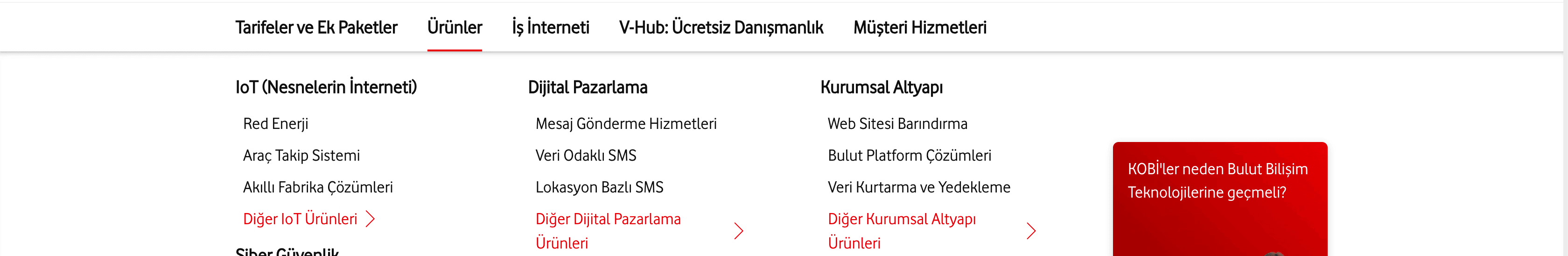
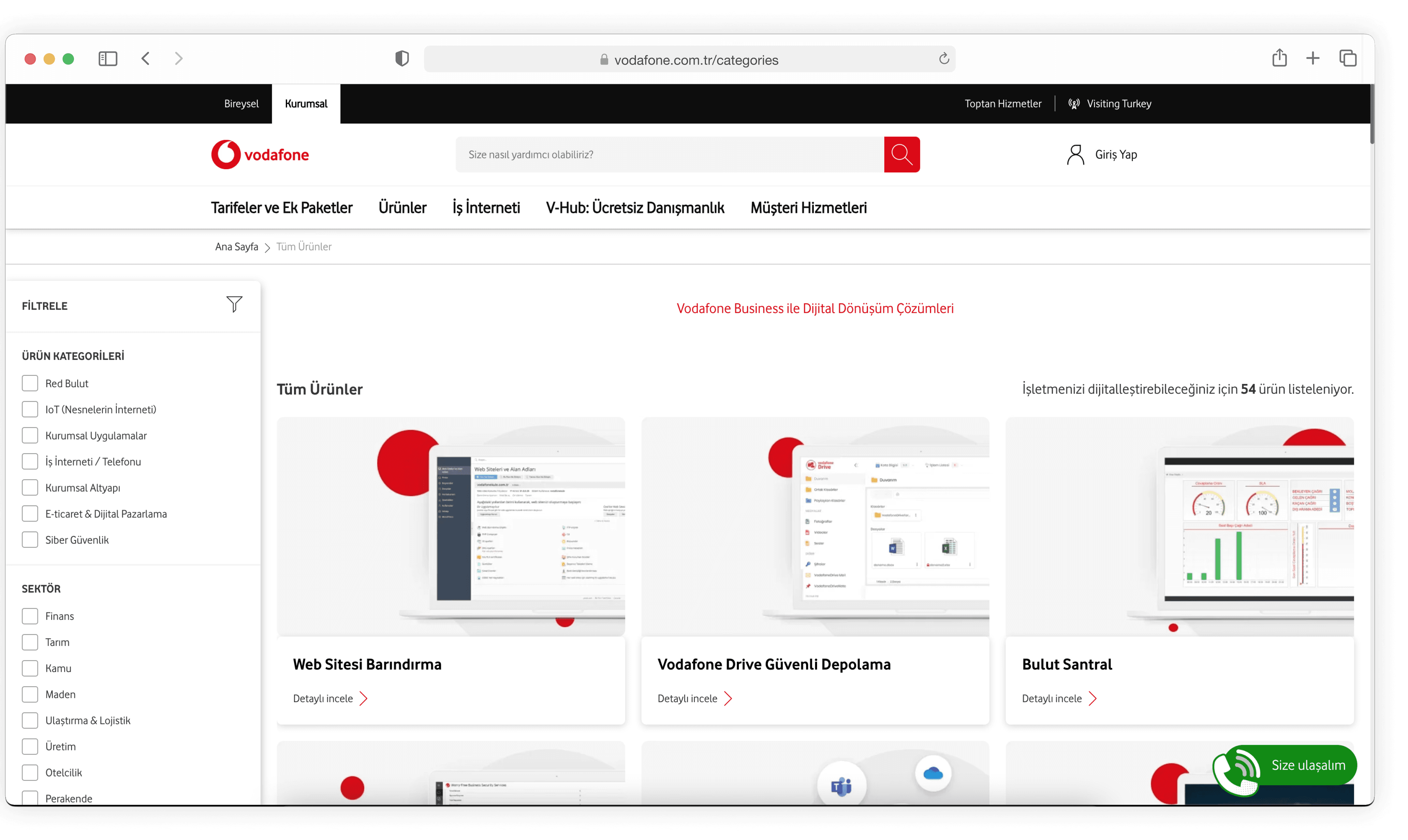
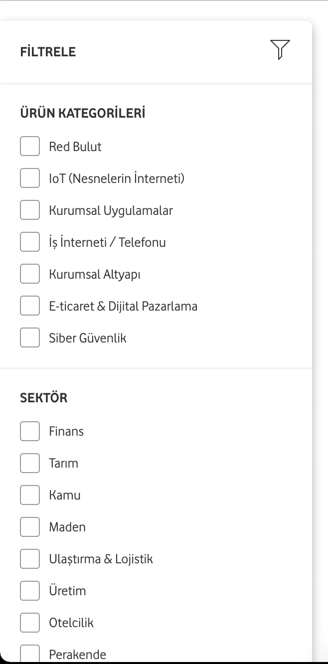
STREAMLINED NAVIGATION
From overwhelm to clarity
Users had difficulty navigating Vodafone Business's many solutions, leading to frustration and bounce rates. We simplified navigation with clear categories and subcategories, improving usability and aligning the design with user expectations through regular feedback.
IA
MEGA MENU
USER TESTING
🔮 RETROSPECTIVE
A first taste of web at scale.
Redesigning Vodafone Turkey's website was a major milestone for me as a beginner in web development. It challenged me to design for multiple devices while exceeding client expectations.
If I could approach the project again, I would explore ways to enhance the design hand-off process to improve collaboration with developers and ensure an even smoother implementation. This experience emphasised the value of iteration and continuous improvement in web design.
01 Designing across multiple devices and breakpoints
02 Exceeding client expectations while keeping pace
03 Smoother hand-off & collaboration with developers
🌀 SEE IT LIVE
You can see all the designs
on Vodafone Turkey's website.
VISIT WEBSITE
vodafone.com.tr
→
Built one thoughtful prompt at a time ✍️
Designed in Figma, made in Framer
2025